SEN
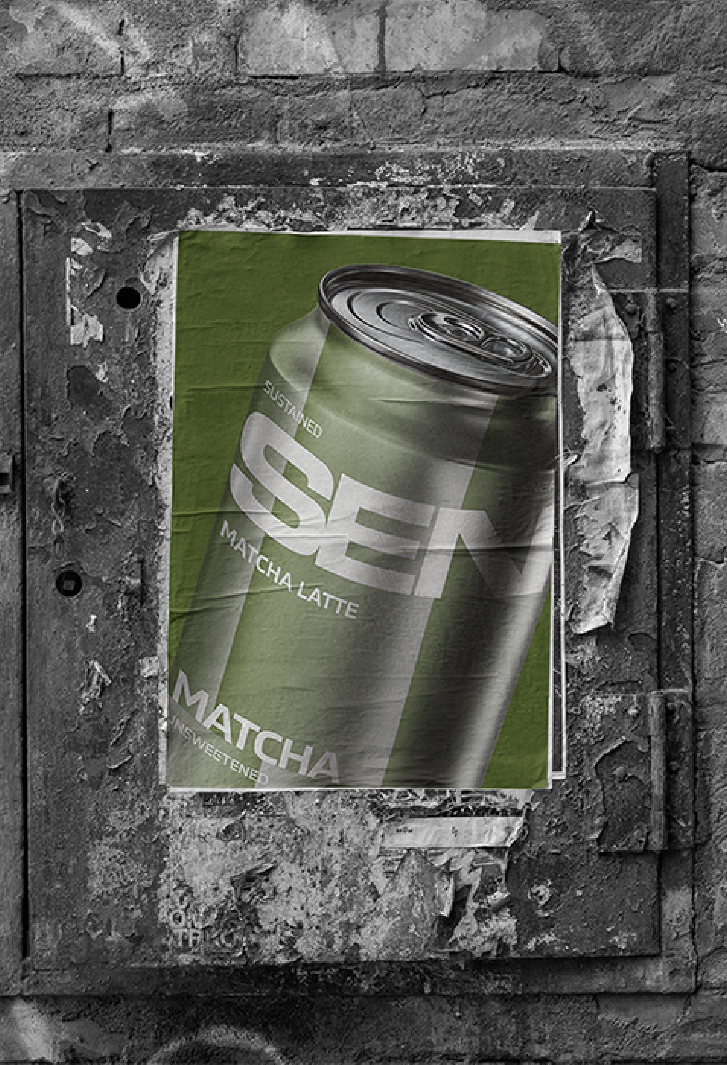
SEN Matcha Latte is an unsweetened matcha drink with 60mg of natural caffeine, perfect for a smooth and sustained energy boost. SEN designed for those who crave natural energy in motion.
Branding
Packaging
The Brief
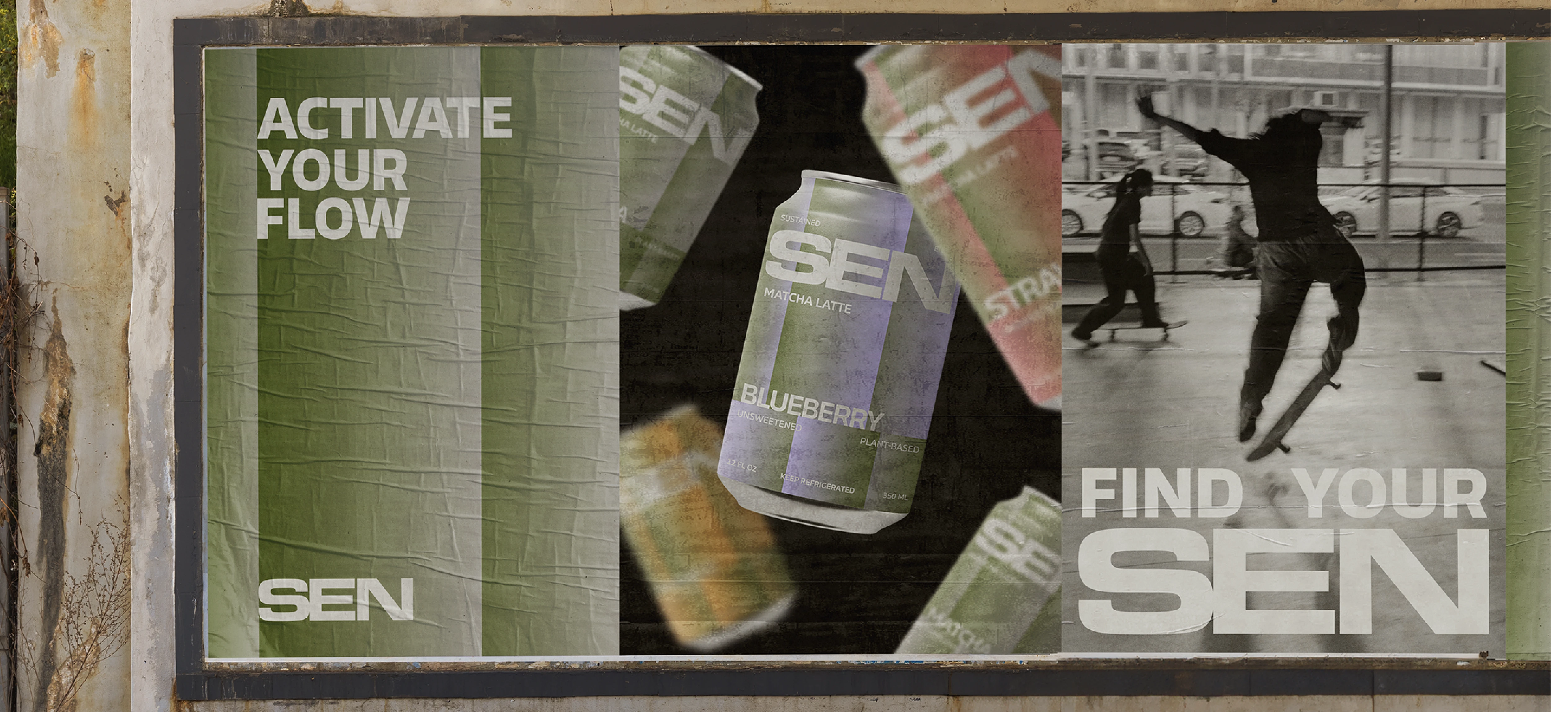
Create a visual identity and packaging system for SEN, matcha latte designed for people seeking natural, sustained energy in their everyday lives. They are active, creative individuals aged 20–35 who value movement, simplicity, and conscious choices. They are runners, skaters, dancers, cyclists, and everyday explorers.
The challenge
Translate the brand's values of purity, simplicity, and movement into a bold yet minimal identity. The design needed to stand out on the shelf while communicating a premium product with clean ingredients and functional benefits.

Research & concept
SEN re-imagines the visual language of matcha. While matcha is often associated with soft, feminine aesthetics and slow rituals, SEN takes a different approach and positions it as a source of natural, neutral energy.
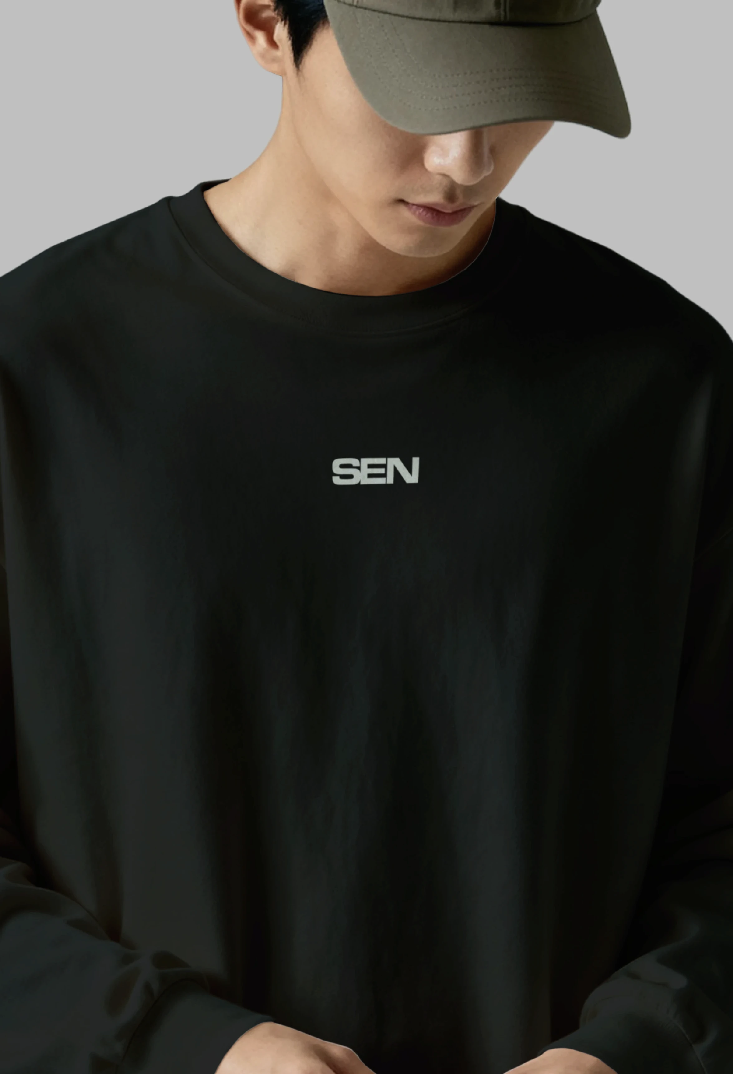
Inspired by street culture and outdoor movement, the identity draws from skateboarding, running, dance. The result is a bold, minimal visual system that feels dynamic without becoming loud.
The name SEN is inspired by the word Zen, reflecting the balance between calmness and energy. Just like matcha provides a smooth, sustained boost rather than a sudden spike, the brand celebrates focused movement, clarity, and confidence.




Typography & Colour
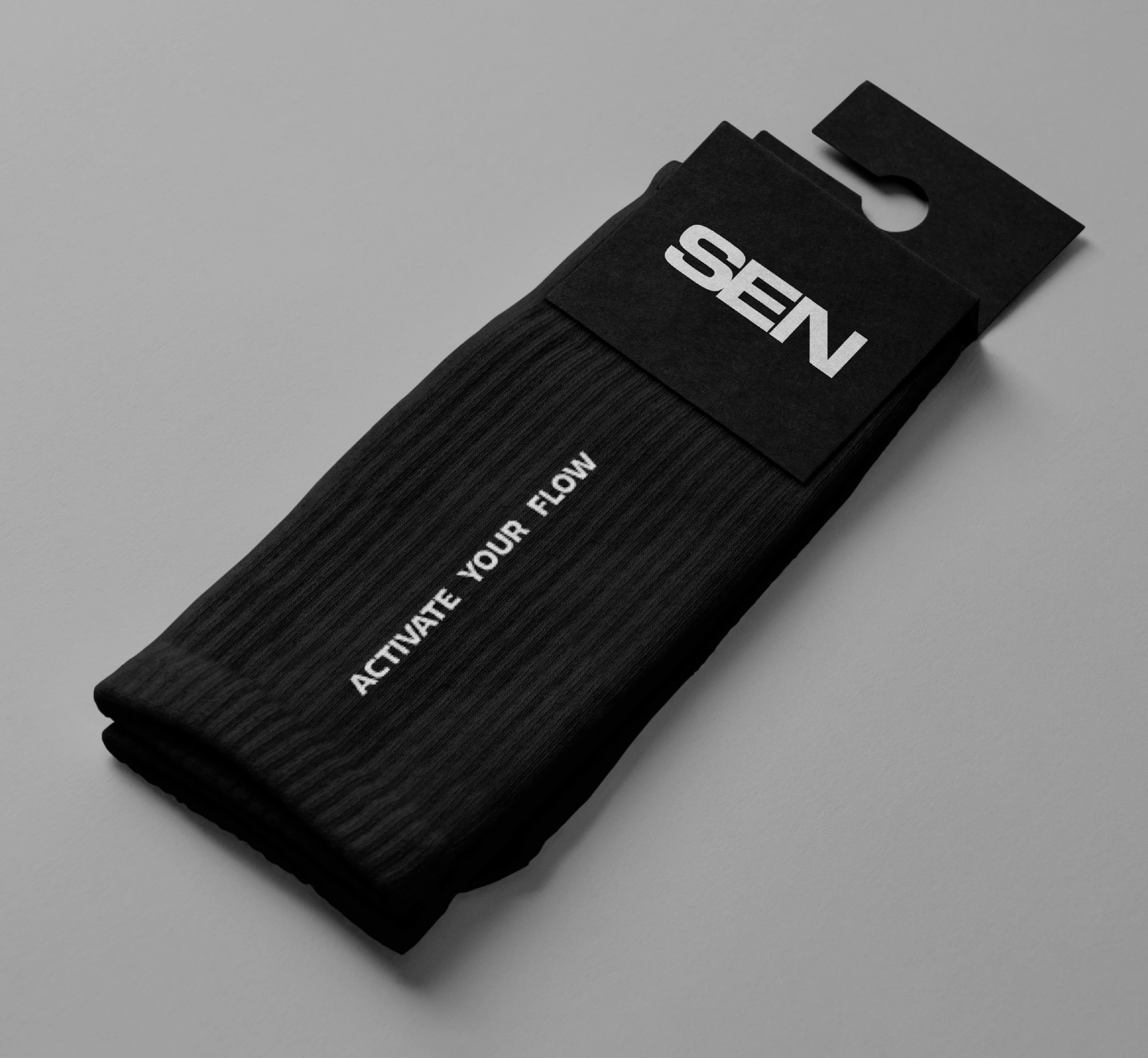
The typography balances bold brand recognition with everyday readability. Eurostile Extended was chosen for the logo to create a distinctive, confident wordmark that reflects movement and precision. Its geometric forms reinforce the brand's modern, performance-driven character.
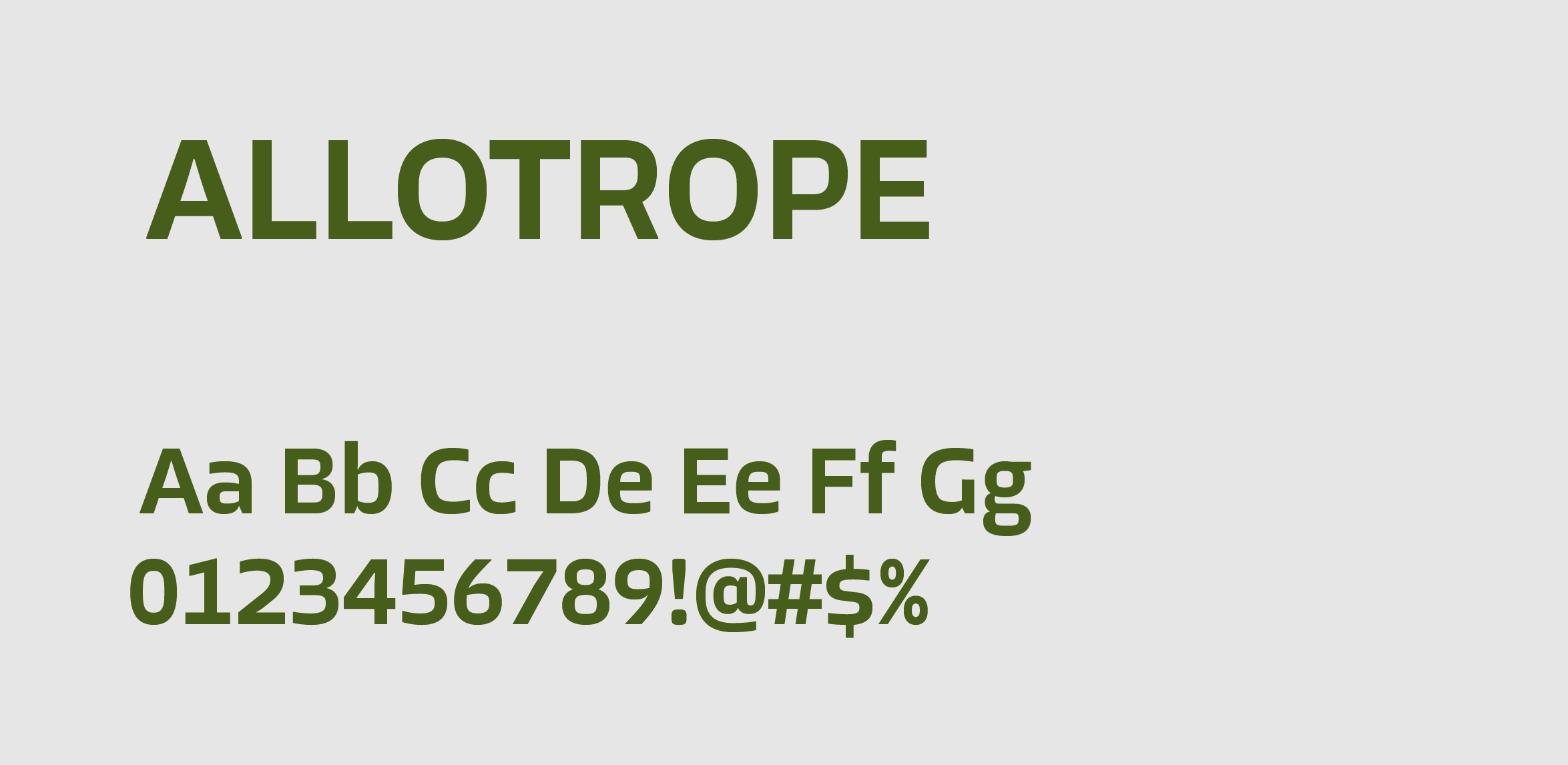
For headlines, slogans, and body copy, Allotrope provides a clean and approachable contrast. Its contemporary sans-serif design keeps communication clear. It maintains the minimal aesthetic that defines the brand. Together, the typefaces create a visual system that feels both functional and energetic.
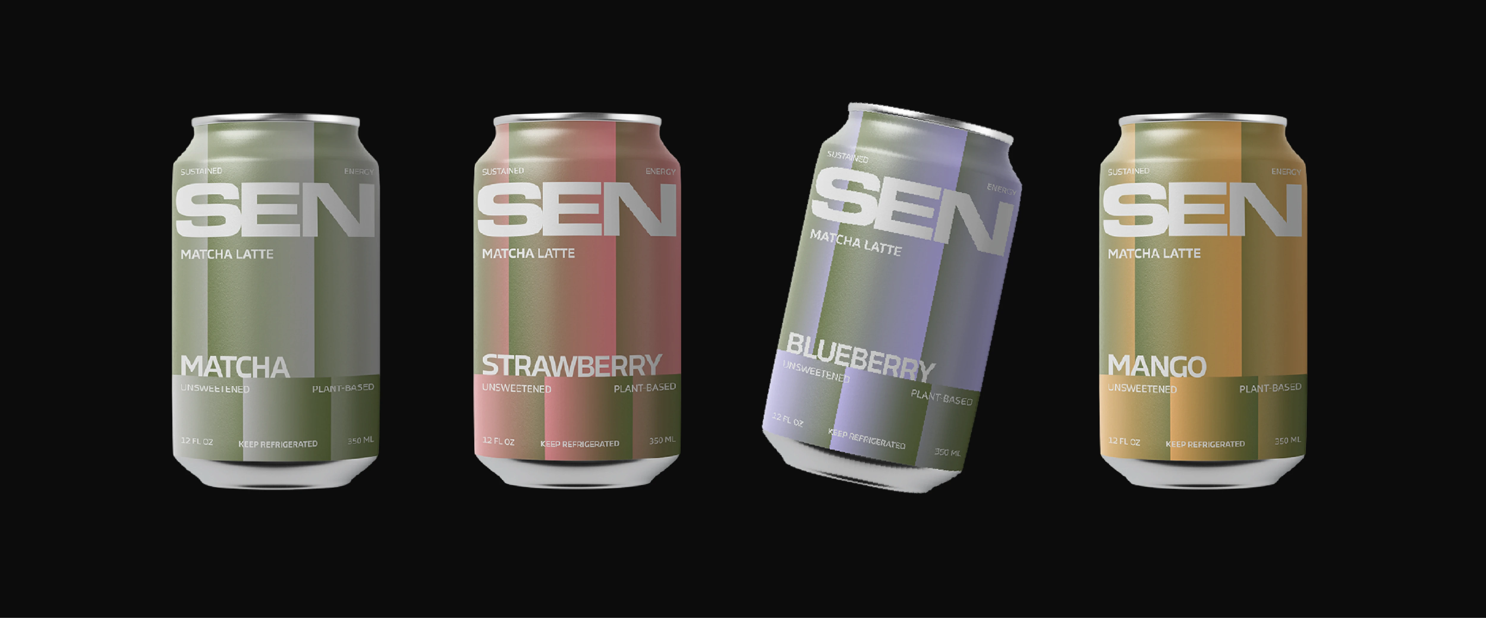
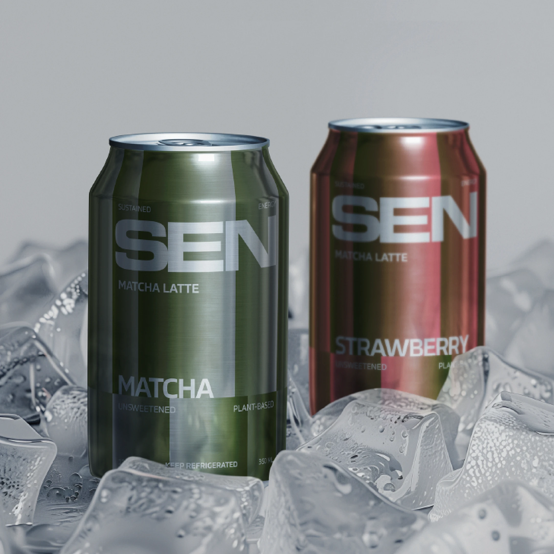
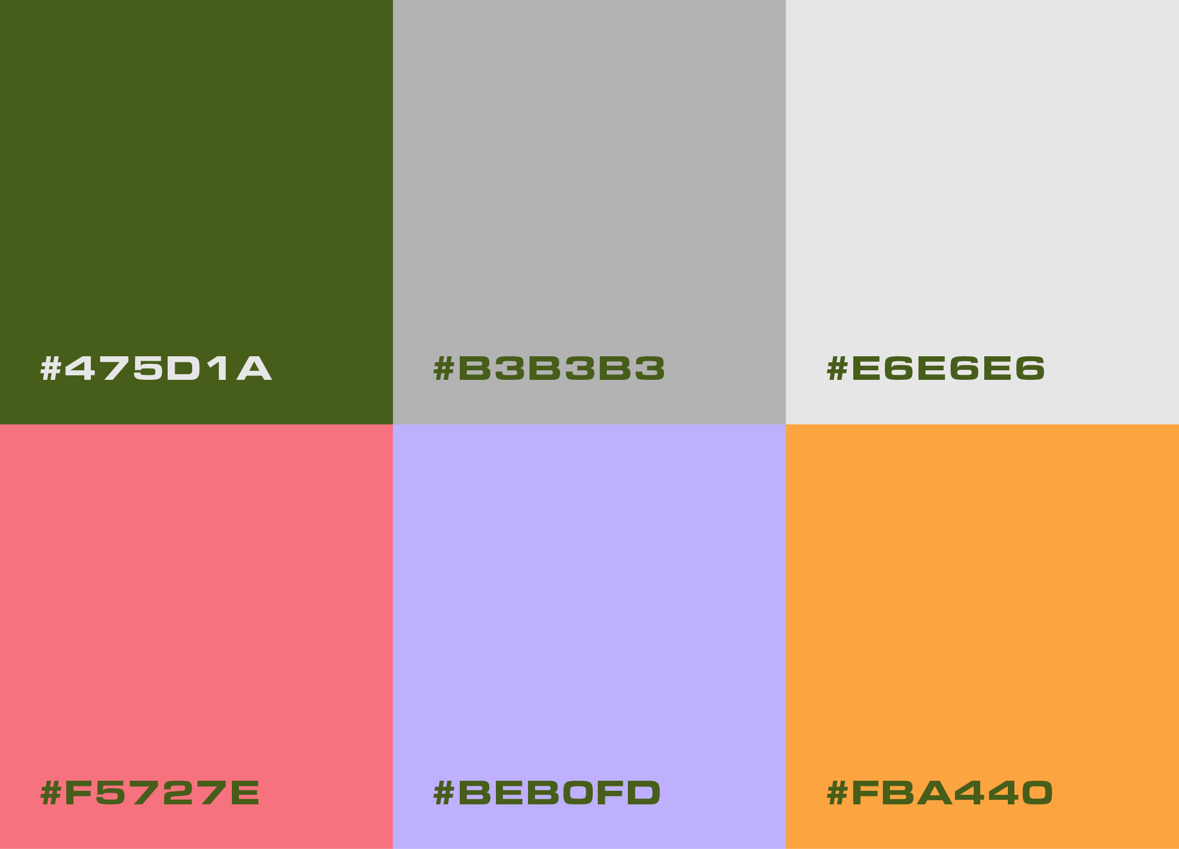
The colour palette is inspired by the natural ingredients from the SEN's range of flavours . A deep matcha green serves as the primary brand colour. Each flavour is represented by its own accent colour: soft lavender for Blueberry, vibrant coral for Strawberry, warm orange for Mango, and neutral grey for Classic Matcha. Light grey provides a clean foundation across print and digital applications.
Gradients play an important role throughout the identity, particularly on the packaging. Blending the flavour colours creates a sense of movement and reflects the smooth fusion of ingredients, adding depth and energy while preserving the brand's minimal visual language.


The Outcome
A cohesive brand identity built around clarity, balance, and modern minimalism. From the logo and typography to the packaging system, every element works together to express SEN's philosophy of clean energy in motion.